FIELD NOTES / Inside the demonstration
A mobile website review, with the evidence left in
Mere & Timber is a fictional garden-room business we built for a real product demonstration. Here is how its recorded mobile visit became a personal critique, and where the evidence stops.
Fictional business. Actual browser recording. Kevin’s AI presenter and linked voice. This is a worked example, not a customer case study or a claim of commercial results.
The question behind the review.
Imagine someone considering a garden room on their phone. Can they understand the offer, browse the projects and find the next step? We recorded the example website at a 390 × 844 viewport and used the retained browser video as the visual reference.
The finished critique combines that mobile recording with Kevin’s presenter. The email introduces two suggestions; the audit page gives the viewer the video, explanation and a way to discuss them. You can explore the whole recipient journey.
Finding one: the gallery runs past the phone.
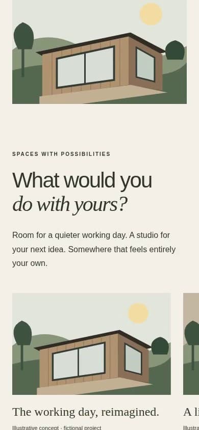
In the finished video, Kevin starts this finding at 7.54 seconds.Open the evidence timeline and choose the gallery card to jump to that spoken moment.
“First, the project gallery runs past the edge of the screen.”
The visible observation is the card extending past the edge. The statement about browsing is the reviewer’s interpretation. The proposed change is to fit each project card to the available mobile width, then test the gallery’s controls and longer content. A partly visible next card can also be an intentional carousel cue; the right design decision depends on how the gallery actually behaves.
We have not measured abandonment or compared enquiries before and after a change. That evidence would be needed to make a claim about commercial impact.
Finding two: the opening needs an enquiry action.
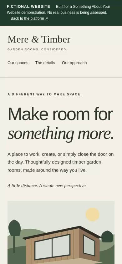
The finding starts at 14.42 seconds in the finished critique.
Our suggestion is a clear “Discuss your garden room” action near the offer. Before implementing it, the agency would agree the intended destination and confirm that the subsequent contact journey works.
This is a proposal. It is not a screenshot of an implemented fix, and it does not establish that a button will increase enquiries. Testing the actual journey is the next useful piece of work.
Why the evidence has two timestamps.
The gallery appears at a different point in the website recording from the moment Kevin discusses it. The timeline therefore shows both the original capture time and the reviewed speech time. Its jump control moves the video to the spoken finding and preserves a paused video until the viewer chooses to play.
These frames were extracted from the actual recording. They are not AI reconstructions or tidied versions of the page. The retained demonstration predates our DOM checkpoint recorder, so historical DOM counts are unavailable. We do not fill those gaps with invented measurements.
One invitation, carried through the journey.
The preview email explains why Kevin recorded the review, uses one clear viewing action and closes with an invitation to reply. The audit page continues the same conversation. The video ends with a proper presenter pause, contact card and fade.
We sent the demonstration to our own inbox for review. No real prospect was contacted, and there are no attributed sales or conversion results to report. The point of the example is to let an agency inspect exactly what it would be asking a prospect to watch.
For a repeatable review method, read how to give a website critique worth listening to.